Note
Go to the end to download the full example code.
Qini and uplift curves#
libuplift follows the convention that Qini curves are drawn with the number of net successes on the y-axis (scaled to treatment group size) and uplift curves with net gain in success probabilites. This conventions follow original publications where the curves were introduced.
The necessary imports#
import numpy as np
np.random.seed(123)

import matplotlib.pyplot as plt

from sklearn.model_selection import train_test_split
from sklearn.preprocessing import OneHotEncoder
from sklearn.preprocessing import StandardScaler
from sklearn.compose import ColumnTransformer
from sklearn.linear_model import LogisticRegression

from libuplift.meta import TLearnerUpliftClassifier
from libuplift.metrics import uplift_curve, Qini_curve
from libuplift.metrics import optimal_uplift_curve, optimal_Qini_curve
from libuplift.metrics import Qini_coefficient
Fetch and prepare data#
from libuplift.datasets import fetch_Hillstrom
D = fetch_Hillstrom(as_frame=True)
trt = D.treatment

# encode categorical features, standardize numerical features
ct = ColumnTransformer([("ohe", OneHotEncoder(), list(D.categ_values.keys()))],
                       remainder=StandardScaler())
X = ct.fit_transform(D.data)

# keep only women's campaign
mask = ~(trt == 1)
X = X[mask]
y = D.target_visit[mask]
trt = (trt[mask] == 2)*1
Fit a model#
X_train, X_test, y_train, y_test, trt_train, trt_test = train_test_split(X, y, trt, train_size=0.7)
m = TLearnerUpliftClassifier(base_estimator=LogisticRegression())
m.fit(X_train, y_train, trt_train, n_trt=1)
Draw uplift and Qini curves#
score = m.predict(X_test)[:,1]

plt.figure(figsize=(10,5))

cx, cy = Qini_curve(y_test, score, trt_test, n_trt=1)
cx_opt, cy_opt = optimal_Qini_curve(y_test, trt_test, n_trt=1)
plt.subplot(1,2,1)
plt.plot(cx, cy, label="curve")
plt.plot(cx_opt, cy_opt, "r-", label="optimal")
plt.plot([0,1], [0,cy[-1]], "k-", label="random")
plt.title("Qini curve (success count)")

cx, cy = uplift_curve(y_test, score, trt_test, n_trt=1)
cx_opt, cy_opt = optimal_uplift_curve(y_test, trt_test, n_trt=1)
plt.subplot(1,2,2)
plt.plot(cx, cy)
plt.plot(cx_opt, cy_opt, "r-")
plt.plot([0,1], [0,cy[-1]], "k-")
plt.title("Uplift curve (success prob.)")

plt.figlegend(ncols=3, loc="lower center")
plt.show()
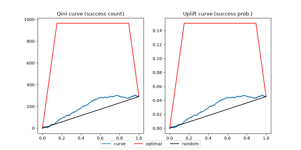
Note that the optimal curves are very high compared to the curves for an actual model. This is a result of high success rate in the control group
Qini coefficient#
Now print the Qini coefficient as defined by Radcliffe and Surry
print("Qini coefficient = ", Qini_coefficient(y_test, score, trt_test, n_trt=1))
Qini coefficient = 0.0737805061591626
The coefficient is the same for Qini and uplift curves, so there is only one function for computing it.
Differences between Qini and uplift curves#
Generally the curves are equivalent since they are scaled copies of one another. However, the Qini curve changes with treated sample size which may affect e.g. the learning curve.
# Draw learning curve using Area Under Qini Curve as score
from libuplift.model_selection import learning_curve
train_sizes, train_scores, test_scores = learning_curve(m, X, y, trt, n_trt=1, scoring="auqc")

train_scores_mean = train_scores.mean(axis=1)
train_scores_std = train_scores.std(axis=1)
test_scores_mean = test_scores.mean(axis=1)
test_scores_std = test_scores.std(axis=1)

def plot_learning_curve(train_scores_mean, train_scores_std,
                        test_scores_mean, test_scores_std,
                        title=""):
    plt.fill_between(train_sizes,
                     train_scores_mean - train_scores_std,
                     train_scores_mean + train_scores_std,
                     alpha=0.1, color='r')
    plt.plot(train_sizes, train_scores_mean, 'ro-', label="Train score")
    plt.fill_between(train_sizes,
                     test_scores_mean - test_scores_std,
                     test_scores_mean + test_scores_std,
                     alpha=0.1, color='g')
    plt.plot(train_sizes, test_scores_mean, 'go-', label="Test score")
    plt.legend()
    plt.title(f"Learning curve ({title})")

plot_learning_curve(train_scores_mean, train_scores_std,
                    test_scores_mean, test_scores_std,
                    "Area Under Qini Curve")
plt.show()
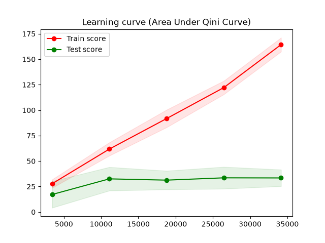
Training Area Under Qini Curve keeps growing with sample size which does not indicate improvements in model performance.
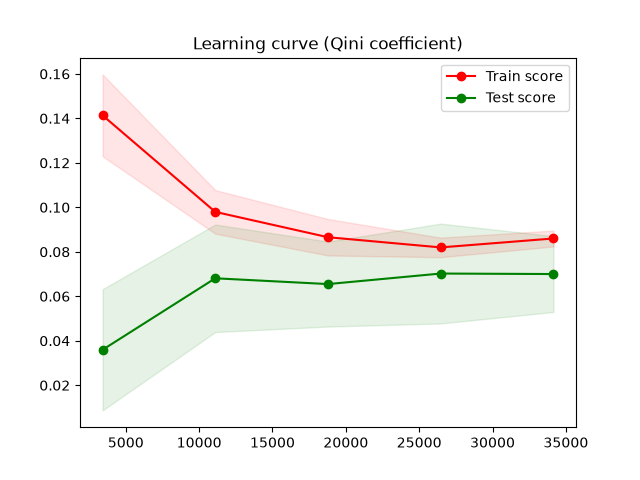
The Qini coefficient is not affected since it is scaled to never exceed 1.
# Draw learning curve using the Qini coefficient as score
train_sizes, train_scores, test_scores = learning_curve(m, X, y, trt, n_trt=1, scoring="Qini_coeff")

train_scores_mean = train_scores.mean(axis=1)
train_scores_std = train_scores.std(axis=1)
test_scores_mean = test_scores.mean(axis=1)
test_scores_std = test_scores.std(axis=1)

plot_learning_curve(train_scores_mean, train_scores_std,
                    test_scores_mean, test_scores_std,
                    "Qini coefficient")
plt.show()
Total running time of the script: (0 minutes 3.105 seconds)